Mobile Friendly Test
Loading tool…
About Mobile Friendly Test
In this age, a lot of people use the internet on mobiles, and their number increases day by day. Therefore it is important to make your website mobile friendly to get millions of views from mobile users. Google also ban the sites that are not mobile-friendly and give ranking to the good responsive websites. Your first step in blogging is to make your website responsive and to check that is it mobile friendly or not. You have to analyze your website for this purpose either you are newbie or expert webmaster. Mobile Friendly Website Checker is the latest tool introduces by SEO Tool Centre, which tells you about your website responsiveness.
What is Mobile Friendly Website Checker Tool?
Almost all specifically Google pay a deep eye on the website speed and its responsiveness for all type of format. If your site is friendly for Mobile Phones, Windows, Tablets, etc. Then you have higher chances of ranking and to increase your visitors. So, it is very important to check your website for these entire formats if you want to get ranked and indexed properly. This is what for which mobile friendly website tester is made and offered to you.

This tool helps you to analyze your website for mobile and tells you that is it responsive or not for mobile users. After that, you can take necessary steps to make it responsive for mobile users. It is estimated that shortly 70% of people will use mobile for the Internet and search their required things from mobiles. So it is very important to make a website responsive for mobile users, and this tool will help you in doing that.
Why use mobile friendly website checker tool?
This responsive mobile checker is very reliable and gives a result equal to Google responsive checker. Web site responsiveness has great importance in SEO and helps to get more visitors than others. This tool helps you to analyze your website and to make it mobile friendly and to catch Android users from your website design.
How does it work?
Mobile Friendly tester generates a report for your website and gives you the result. When you enter the URL of your website and click on the submit button, it starts analyzing the website and gives you results in the form of a report. It gives results with screenshots and helps you to understand where you need to make changes.
How to test if a page is mobile friendly
- Enter the page address and click Test mobile friendliness. Paste the full URL, including https://. Test the pages people visit most, not only the homepage.

- Read the score and the checks. You get a score out of 100 and a table of checks: a viewport meta tag that uses
width=device-width, zooming not blocked, responsive CSS (media queries), no Flash or plugins, HTTPS and a page size under 500 KB. A cross shows what to fix.
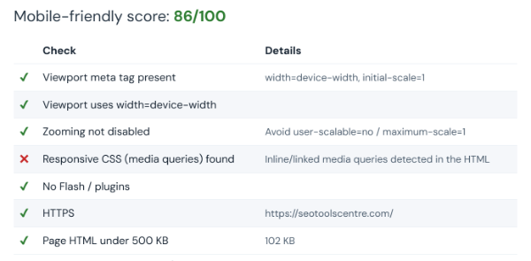
- Fix the failed checks and test again. The test reads the page’s HTML. For a full picture of how the page renders on a phone, also run Lighthouse in Chrome DevTools or try our screen resolution simulator.
Last updated: